
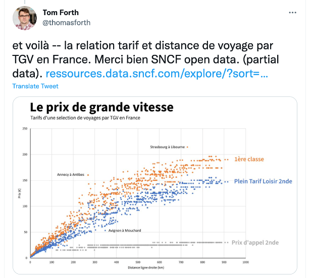
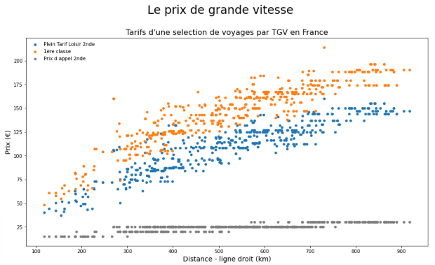
Back in October Tom Forth tweeted about the rich amount of open data published by SNCF, compared to railways in Britain, and seemingly quickly produced the chart below, comparing tariffs vs distance in France:
To extend my Python skills I thought I’d have a go at reproducing this, which meant getting two sets of data – distances between stations and the tariff pairs between stations.
Distance between SNCF stations
Find the stations
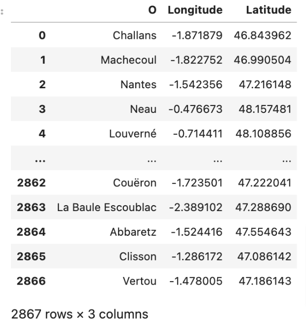
The SNCF publishes an open data set, Gares de voyageurs, that provides data (including latitude and longitude) about SNCF stations. This contains 29 fields concerning 2867 stations and needed a bit of work to clean up:
- Identify all the columns
- Keep only the three relevant columns: ‘Longitude’, ‘Latitude’ and ‘Intitulé gare’
- Remove hyphens in stations names (the Tarifs data set does not contain hyphens)
- Rename ‘Charles de Gaulle’ to match name in the Tarifs dataset.
- Reorder columns ‘Intitulé gare’, ‘Longitude’, ‘Latitude’
I then needed to created two versions of the dataframe, renaming ‘Intitulé gare’ as ‘O’ for Origin in one and ‘D’ for Destination in the other:
Calculate the distances
Having established the latitudes and longitudes of SNCF stations I needed to calculate the distance between them. I found Ashutosh Bhardwaj’s article Calculating distance between two geo-locations in Python, where he shares how to calculate straight line distances, using the Haversine Distance formula. The Haversine formula calculates the shortest distance between two points on a sphere using their latitudes and longitudes measured along the surface.
Firstly I needed to concatenate latitude and longitude for both the O (Origin) and D (Destination) dataframes.
# concatenating lat and long to create a consolidated location as accepted by havesine function
gares_O['coor'] = list(zip(gares_O.Latitude, gares_O.Longitude))
gares_D['coor'] = list(zip(gares_D.Latitude, gares_D.Longitude))
Then, using Bhardwaj’s example as a template I defined a function to calculate distance between two locations:
# defining a  function to calculate distance between two locations
# loc1= location of an origin station
# loc2= location of a destination station

def distance_from(loc2,loc1):
    dist=hs.haversine(loc2,loc1)
    return round(dist,2)
Then ran a loop to parse station location one by one to distance from function:
# running a loop which will parse customers location one by one to distance from function
for _,row in gares_D.iterrows():
    gares_O[row.D]=gares_O['coor'].apply(lambda x: distance_from(row.coor,x))


gares_O.head()
This produced a matrix showing the distance between each of the station pairs, which I converted into tidy data for further processing:
# Reshape to tidy data

tidy_gares_O = pd.melt(gares_O,
                       ["O"],
                       var_name="D",
                       value_name="dist")
tidy_gares_O = tidy_gares_O.sort_values(by=["O"])
tidy_gares_O.head(20)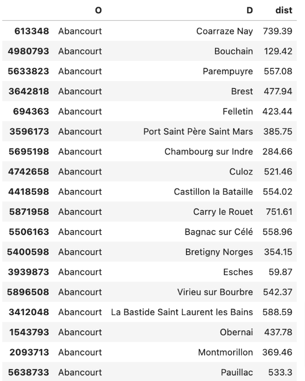
Then a little more cleaning up, to give me the finished Origin and Destination station and distance dataframe:
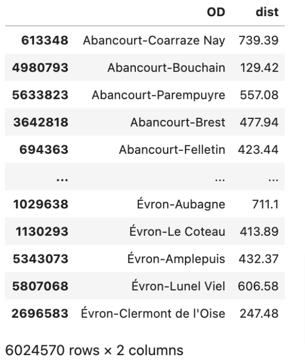
- Created a concatenated column ‘OD’ with station names joined by ‘-‘, to match the Tarif dataset
- Drop the ‘O’ and ‘D’ columns
- Reorder columns to “OD’ and ‘dist’
TGV tariffs by sector
The SNCF publishes an open data set, Tarifs TGV par trajet, that list TGV tariffs for all the “Origin-Destination” prices for 3 ‘classes’: (Prix d’appel 2nde, Plein Tarif Loisir 2nde and Plein Tarif Loisir 1ère).
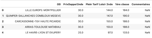
Again some data cleansing was necessary:
- Drop the ‘Commentaires’ column
- Reorder the columns
- Change the ‘OD’ column strings to title case
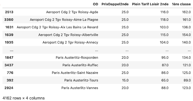
Merging the dataframes
I could now merge the two dataframes into a new dataframe, ‘gareprix’.
garesprix = pd.merge(tarifs,
                     tidy_gares_O,
                     on ='OD',
                     how ='left')
garesprix = garesprix.dropna()

garesprix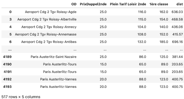
I made a quick plot to check things out:
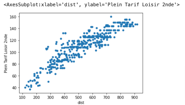
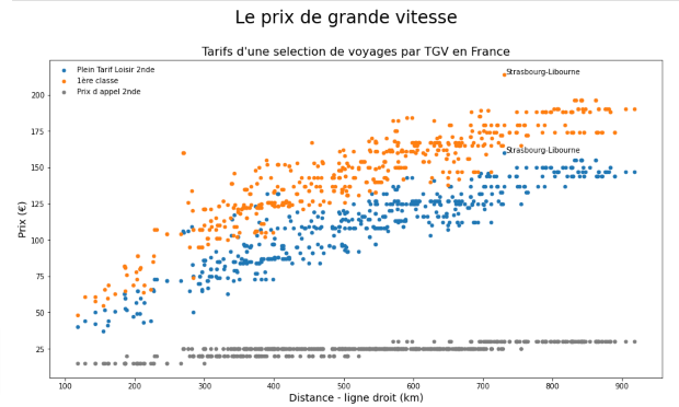
I then used Matplotlib to develop a more sophisticated plot, showing the three tariffs:
To annotate some outliers I identified maxima and minima for each of the three tariffs and identified which journeys they applied to. The final Matplotlib code was:
import matplotlib.pyplot as plt
import pandas as pd

fig, ax = plt.subplots(figsize=(15, 8))
ax.scatter(x = garesprix['dist'], y = garesprix['Plein Tarif Loisir 2nde'], label='Plein Tarif Loisir 2nde', color = 'tab:blue', s=20)
ax.scatter(x = garesprix['dist'], y = garesprix['1ère classe'], label='1ère classe', color = 'tab:orange', s=20)
ax.scatter(x = garesprix['dist'], y = garesprix['PrixDappel2nde'], label='Prix d appel 2nde', color = 'tab:gray', s=20)
plt.xlabel("Distance - ligne droit (km)", fontsize=14)
plt.ylabel("Prix (€)", fontsize=14)

plt.title('Tarifs d\'une selection de voyages par TGV en France',fontsize=16)
plt.suptitle('Le prix de grande vitesse',fontsize=24, y=1)

plt.legend(frameon=False, loc='upper left')
plt.text(733, 214, 'Strasbourg-Libourne')
plt.text(733, 160, 'Strasbourg-Libourne')
plt.show()
Giving me the following scatterplot:
I’m sure there are neater ways of doing this, but I learned quite a lot getting here and if you want to see
If you want to see the whole code you can visit my github page: https://github.com/peterjordaninfo/Essais .